
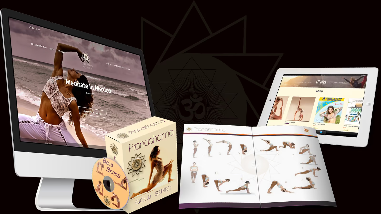
Pranashama
One academy, many media surfaces
The project
An organization-wide brand transformation spanning identity, responsive web direction, educational products, events, retreats, and community touchpoints.
Context
The project record captures a moment when multiple health ventures, offers, and media surfaces needed to become legible as one academy.
The design challenge was structural as well as visual: reorganize the story around a coherent institution and community rather than a collection of disconnected offers.
Creative response
Build the world,
not just the surface.
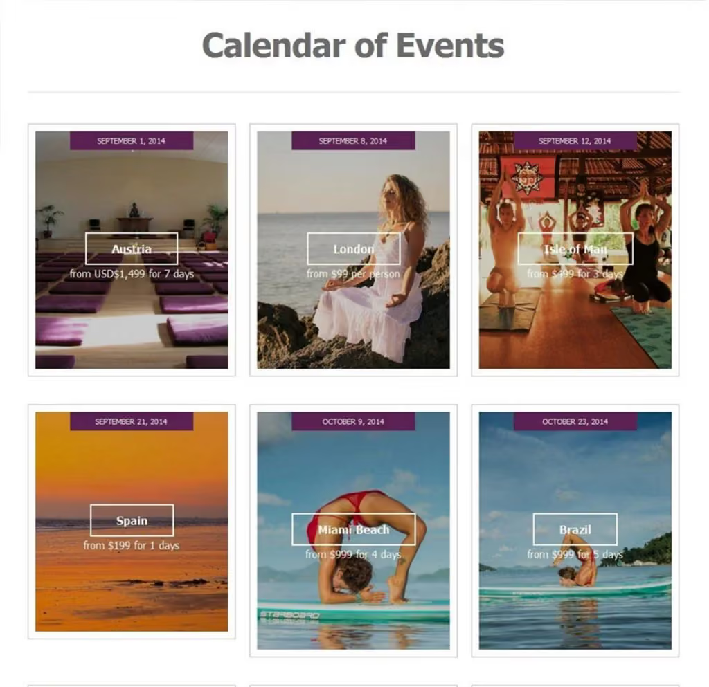
HardMagic reframed the brand around the academy, simplified its public paths, and built an editorial hierarchy that could hold practice, teaching, products, and place without erasing their differences.
Identity artifacts and interface compositions were designed as related chapters rather than isolated campaign pieces.
Principles in operation
Durable ideas,
actively applied.
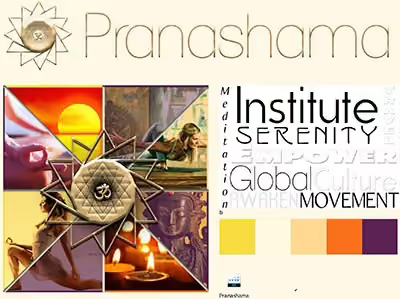
- 01A flexible editorial brand system
- 02Connection between digital and physical experience
- 03Product packaging treated as part of the learning narrative
Where this capability lives now
Studio pairs expressive identity with structured knowledge, accessible video, community consent, lifecycle analytics, and clear source and rights metadata.
One editorial system can now direct image, motion, voice, product media, and channel variants together.